Overview
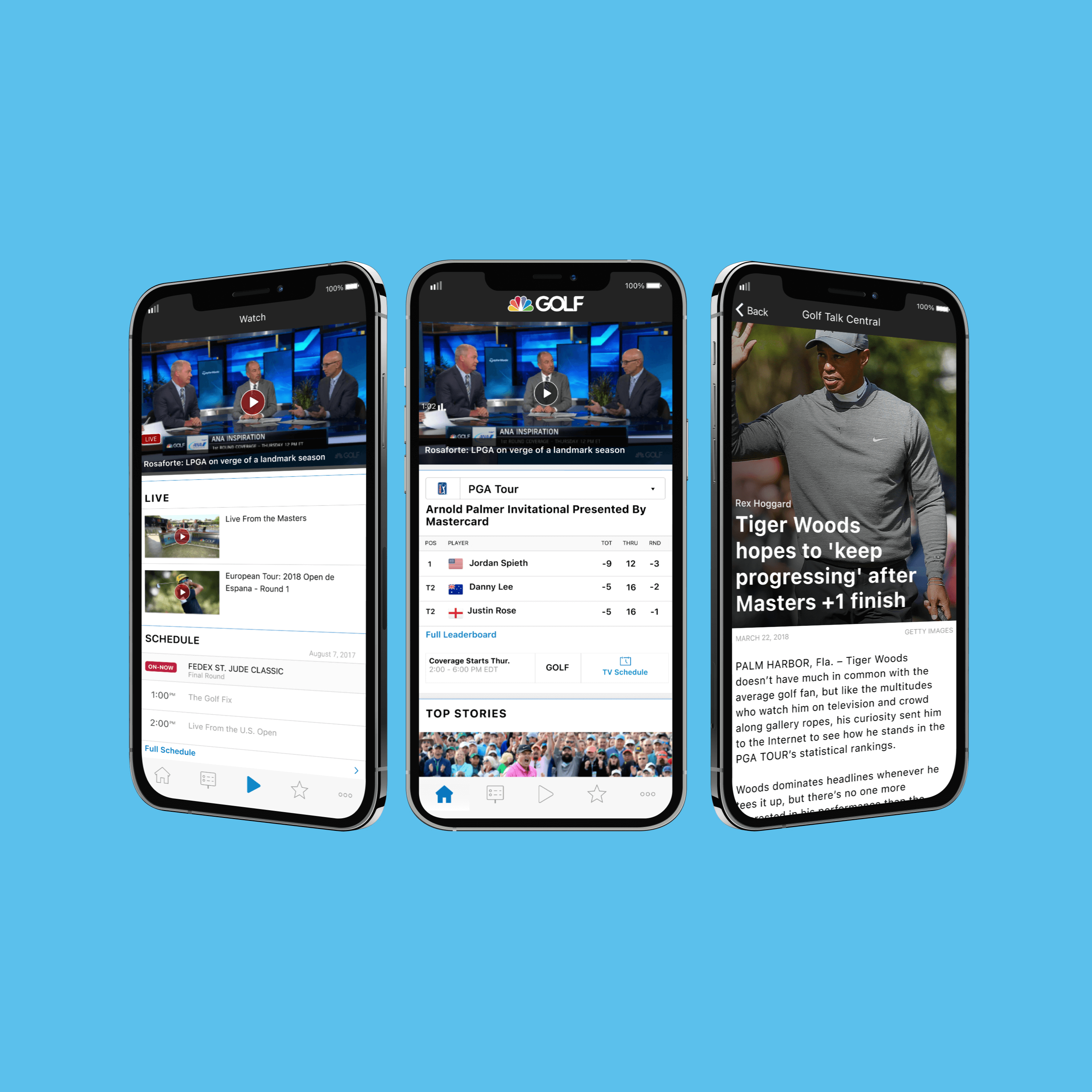
In my role as Lead UX/UI Designer at NBC Sports Next, I spearheaded the design of the Golf Channel App, a comprehensive digital ecosystem that serves as the premier destination for golfers seeking a blend of world-class entertainment and technical instruction. My goal was to create a cohesive, "always-on" companion that elevates the sport's digital presence to a premium, subscription-grade level. The platform is architected to handle high-production long-form video, real-time editorial content, and a deep library of instructional series, providing a seamless experience across web and mobile platforms for golfers of all skill levels.
Problem Statement
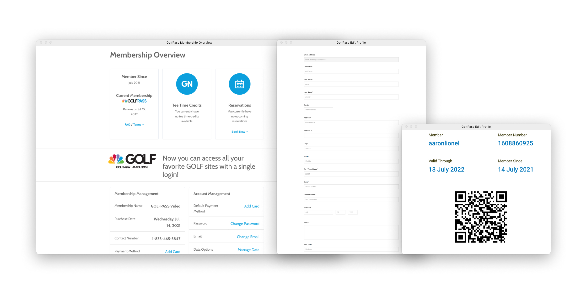
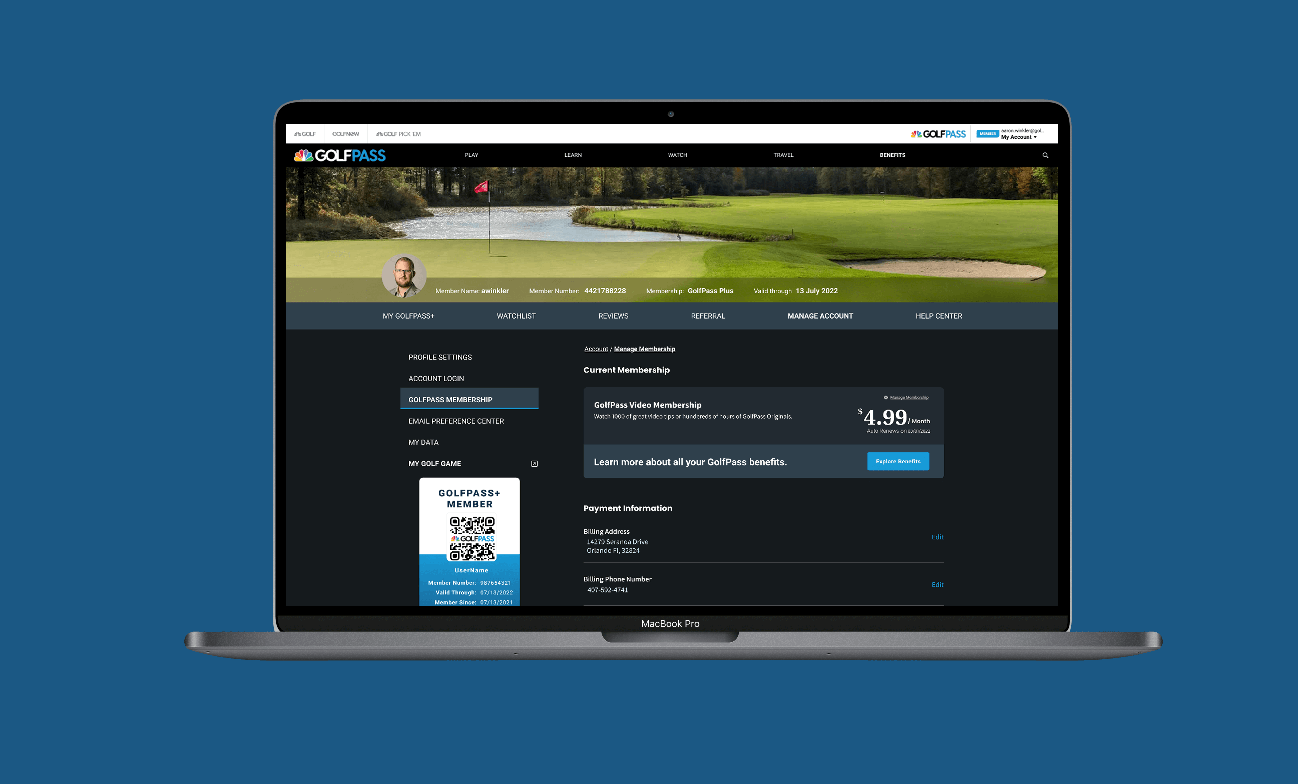
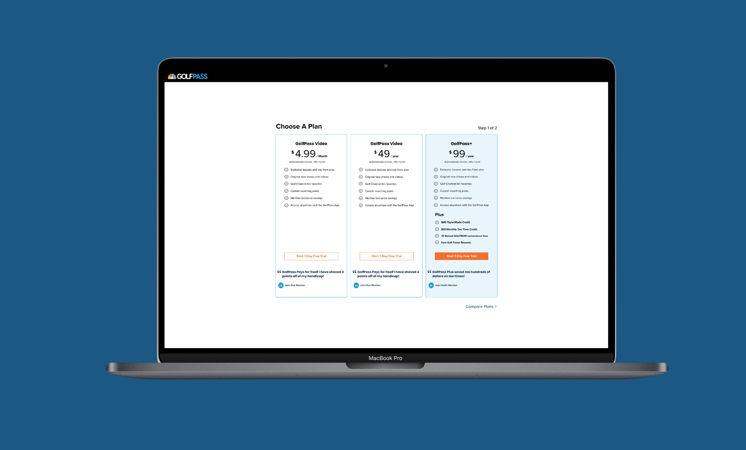
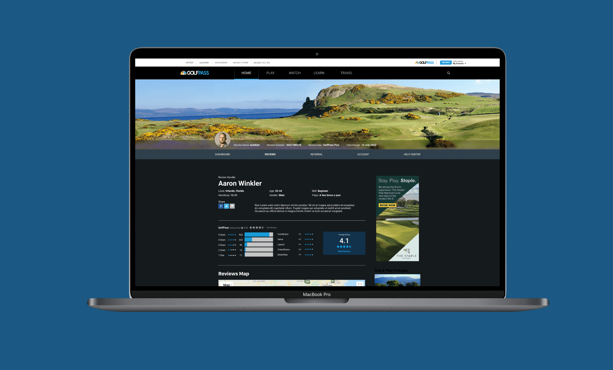
The "before" state of the account management system was a significant friction point in the user journey. It relied on a fragmented, white-labeled layout that felt disconnected from the immersive media experience of the main app. Key membership data, such as "Tee Time Credits" and "Valid Through" dates, was presented in a static, uninspiring grid with no clear hierarchy. Users were forced to navigate through dense forms and disparate pages to perform simple tasks like updating a profile or checking a rewards balance. My challenge was to humanize this data and create an interface that felt less like a billing portal and more like a personalized "locker room" for the modern golfer.
Solution
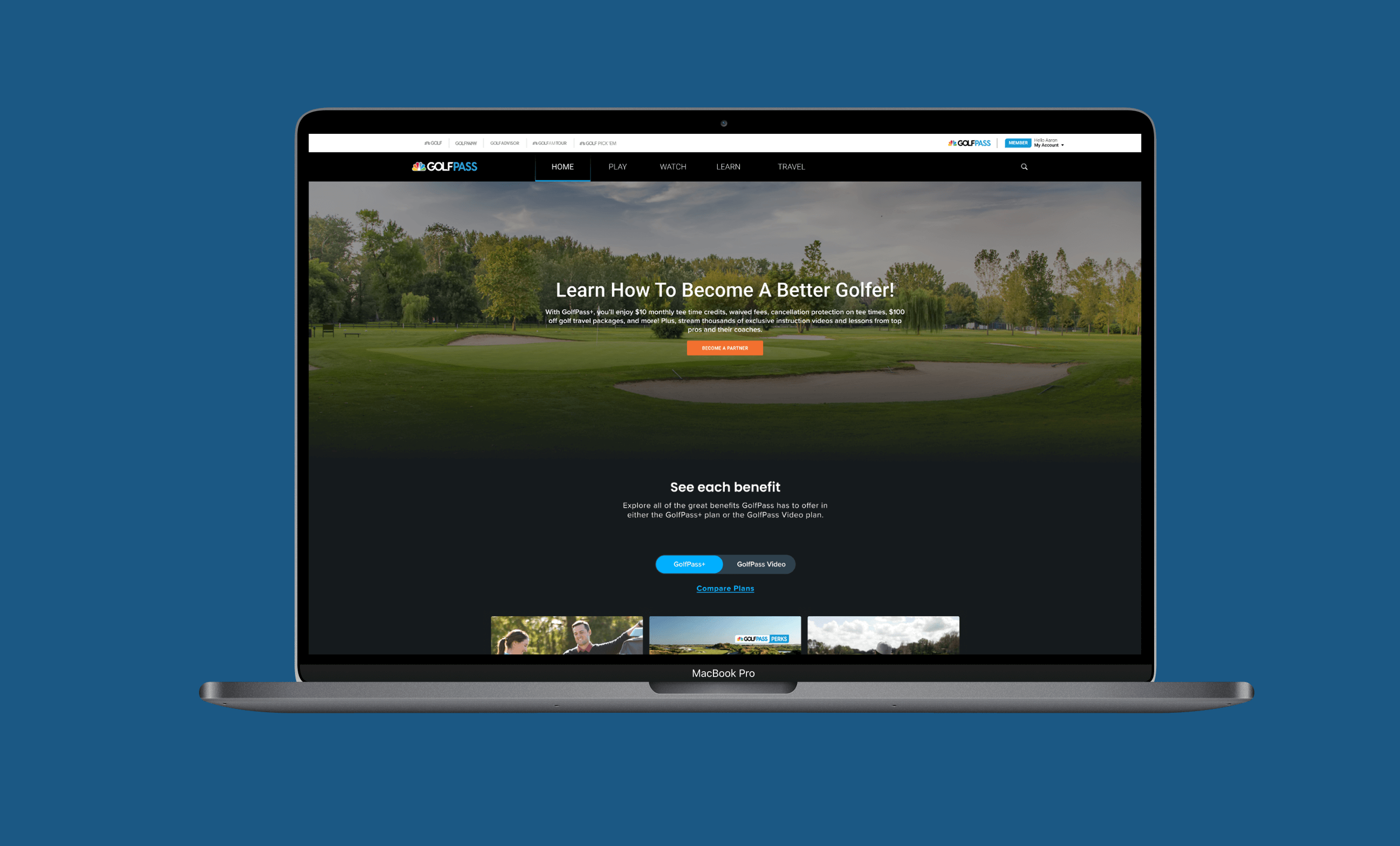
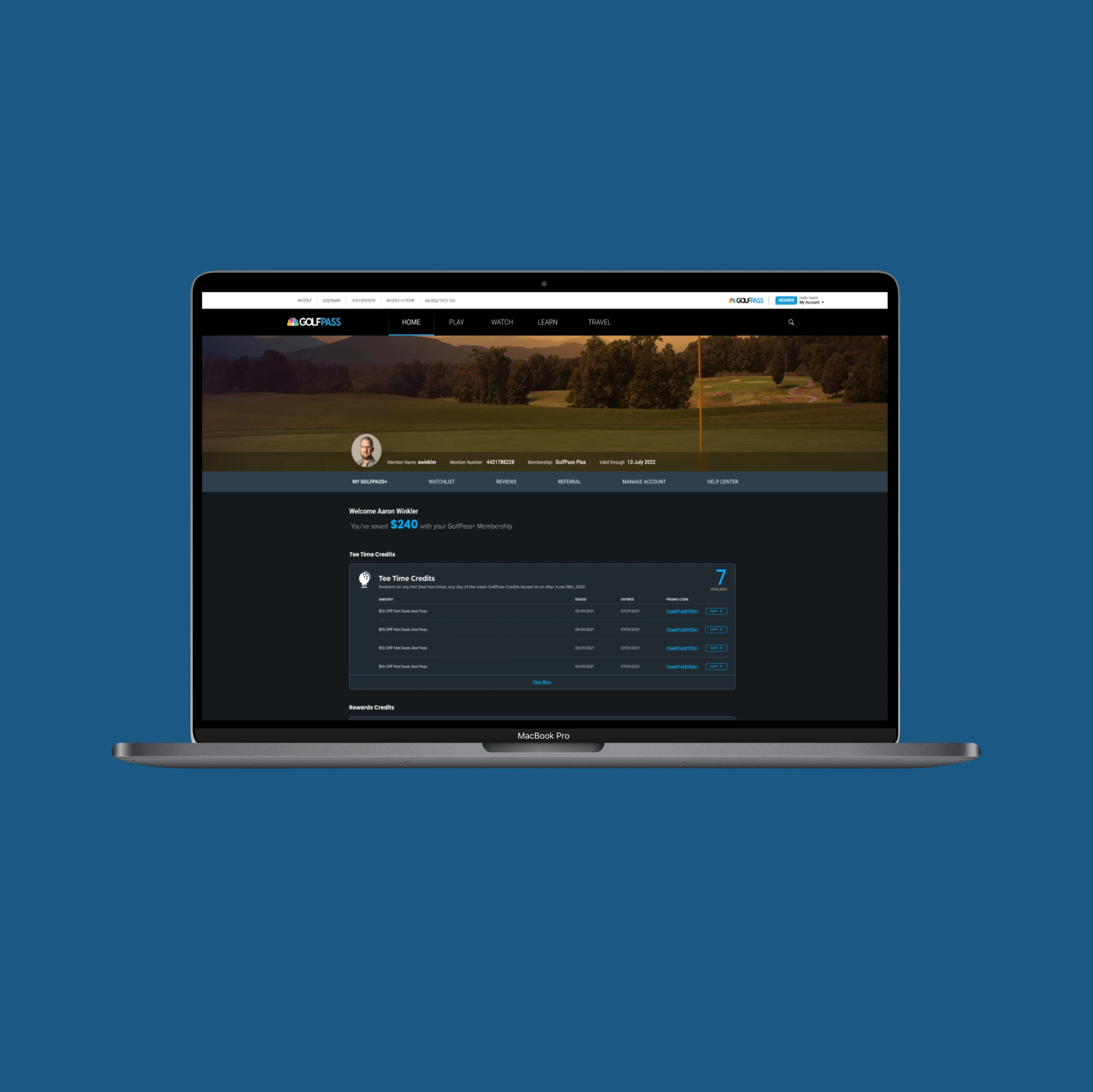
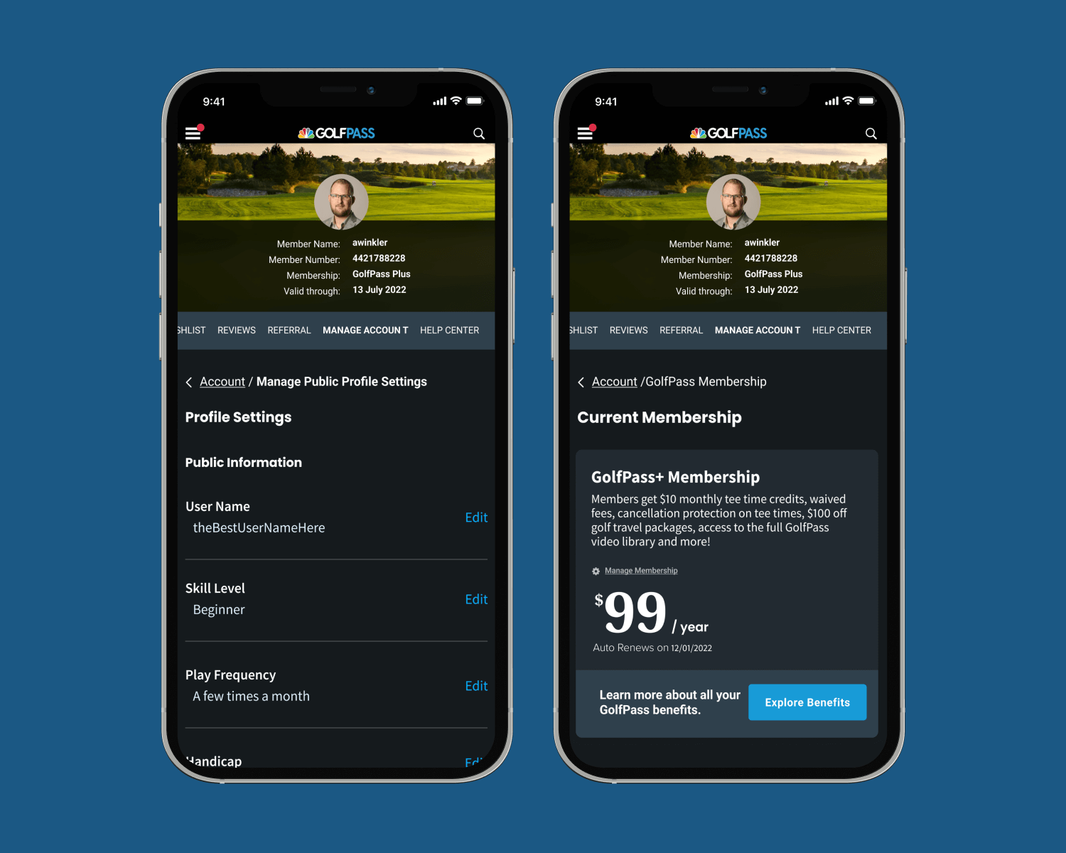
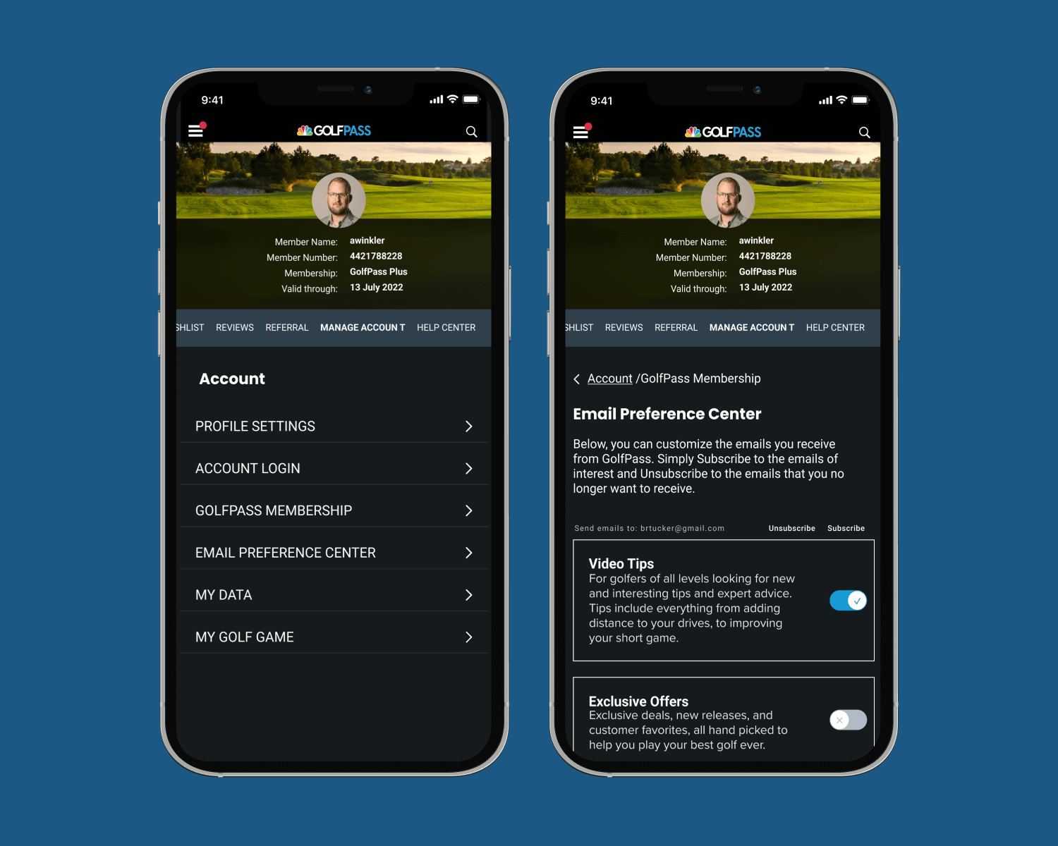
I designed a media-centric, dark-mode dashboard that aligns with the global GolfPass design language, ensuring a seamless transition from content consumption to account management. By introducing a modular card-based architecture, I was able to surface actionable data at a glance while hiding secondary administrative tasks within a clean, intuitive navigation.
Integrated Membership Hub: I replaced the disjointed "before" layout with a unified header that features the member’s profile, skill level, and handicap. This establishes an immediate sense of ownership and personal progress.
Visual Credit & Reward Tracking: Rather than simple text strings, I designed prominent status cards for "Tee Time Credits" and "Rewards," utilizing high-contrast typography and clear call-to-actions to encourage redemption and engagement.
Streamlined Preferences Management: I reimagined the "Email Preference Center" and "Profile Settings" as a series of simple toggles and clean input fields. This reduces the cognitive load during administrative tasks and allows members to tailor their experience—from technical video tips to exclusive offers—with minimal effort.
Mobile-Optimized Global Identity: I ensured the "Global QR Code" and member identification were easily accessible on mobile, facilitating a frictionless "real-world" experience for members at participating golf courses.